Step inside the hushed, hallowed halls of a modern private members’ club, and you’ll be enveloped by a feeling more than a style. The frantic energy of the city dissolves at the threshold, replaced by an atmosphere of cultivated calm and understated confidence. Look closer, and you’ll notice a unifying thread weaving through these spaces of privilege and connection: a palette of soft, creamy, impossibly rich neutrals. This is not beige. This is not off-white. This is Chantilly Blonde—a color philosophy that’s become the silent signature of exclusive enclaves worldwide, signaling a definitive shift away from stark minimalism and moody drama toward a new era of quiet luxury.
The Anatomy of a Chantilly Blonde Palette
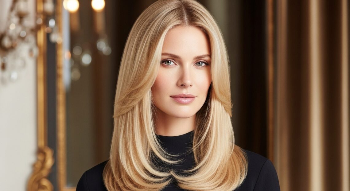
So, what exactly defines this elusive shade? Chantilly Blonde is more a spectrum than a single Pantone. It draws its name from the luxurious, air-whipped cream—hinting at a color that is rich yet light, substantial yet soft. Imagine the warm undertone of vanilla bean, the subtle golden hue of aged parchment, the creamy depth of French limestone, and the soft glow of beeswax candles. It sits deliberately between stark white and yellowy beige, avoiding the coldness of the former and the dated feel of the latter.
This is a color designed to flatter both people and spaces. It reflects light gently, creating a luminous, forgiving ambiance that makes everyone look their best—a non-negotiable in spaces built for networking and socializing. It provides a neutral, yet deeply warm and textured, backdrop that allows art, architecture, and, most importantly, the members themselves to take center stage. Unlike trendy dark greens or navies, Chantilly Blonde doesn’t dictate a mood; it curates a feeling of ease and timelessness.
A Sanctuary from the Digital Glare: The Psychology of Calm
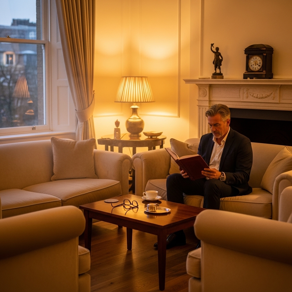
The ascent of Chantilly Blonde is a direct response to our over-stimulated, digitally saturated lives. Private members’ clubs sell exclusivity, but they are ultimately selling an experience and an environment. In a world of blue-light glare, chaotic news cycles, and sensory overload, these clubs offer a sanctuary. The creamy, warm neutrality of Chantilly Blonde is psychologically soothing. It lowers the heart rate, reduces visual noise, and creates a cocoon of safety and retreat.
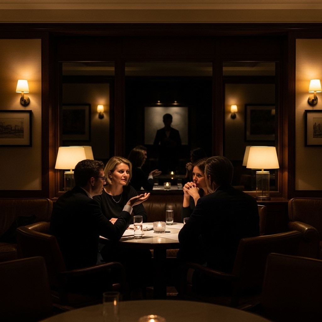
This is a calculated move away from the high-contrast, Instagram-bait interiors of the late 2010s. Clubs are no longer designed primarily for the camera; they are designed for prolonged, real-human comfort. The palette encourages lingering—over a second espresso, through a third conversation, deep into the evening. It tells the member, “You can relax here. You can think here. You are protected from the outside.” In an attention economy, offering genuine, unplugged calm is the ultimate luxury.
The Texture of Luxury: Beyond a Flat Coat of Paint
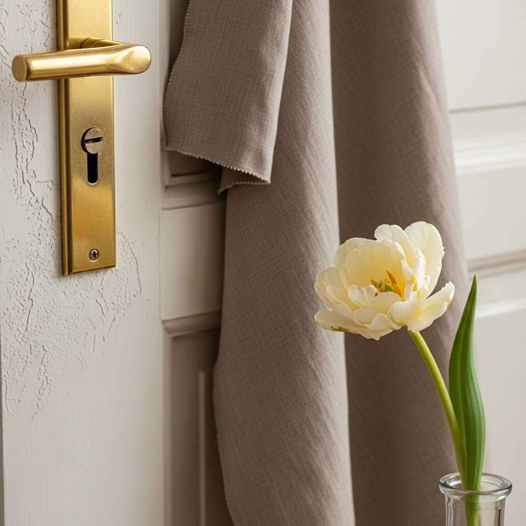
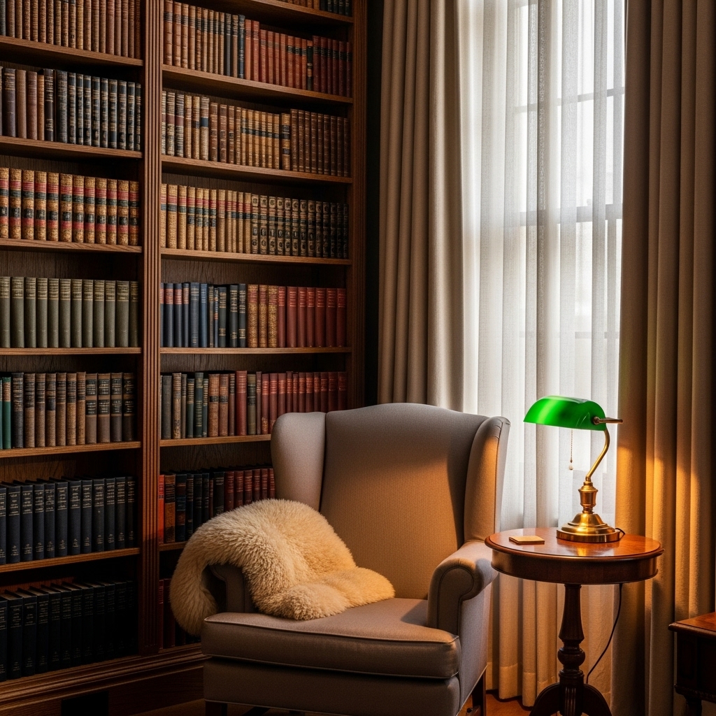
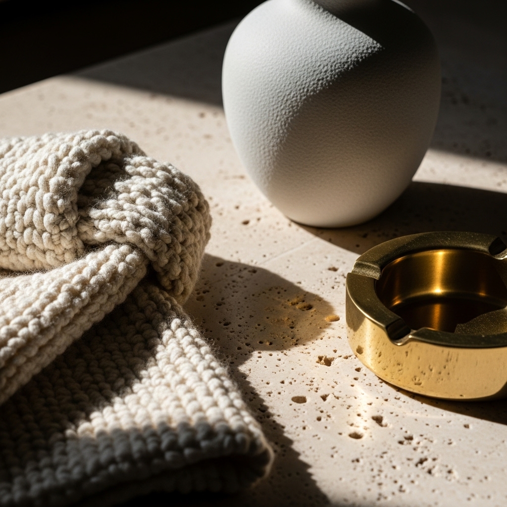
Chantilly Blonde would fall flat if it were just a paint color. Its magic lies in its multi-layered, textural application. In these exclusive clubs, the color is expressed through a tapestry of luxurious materials that invite touch and deepen the visual experience. Think: walls finished in soft, irregular Venetian plaster or lime wash that plays with light and shadow. Upholstery in nubby bouclé, buttery aniline-dyed leather, and heavy-weight linen. Curtains in raw silk that shimmer faintly. Rugs in undyed, creamy wool with a chunky weave.
This focus on natural texture is key. It adds visual interest without resorting to pattern or bright color, maintaining the serene atmosphere. It also speaks to a heritage of craftsmanship and quality—values that resonate deeply with a discerning membership. The club feels not just designed, but cultivated, like it has evolved organically into a state of perfect, comfortable elegance. The tactile nature of the space reinforces a sense of physical, real-world connection, a subtle antidote to our virtual existences.
The Perfect Frame: Showcasing Art, Architecture, and Life
One of the most strategic uses of the Chantilly Blonde palette is its role as the ultimate curatorial backdrop. In many historic clubs housed in grand buildings, the color serves to highlight exquisite architectural details—ornate moldings, carved fireplace mantels, herringbone floors—without competing with them. It provides a cohesive flow between old and new elements.
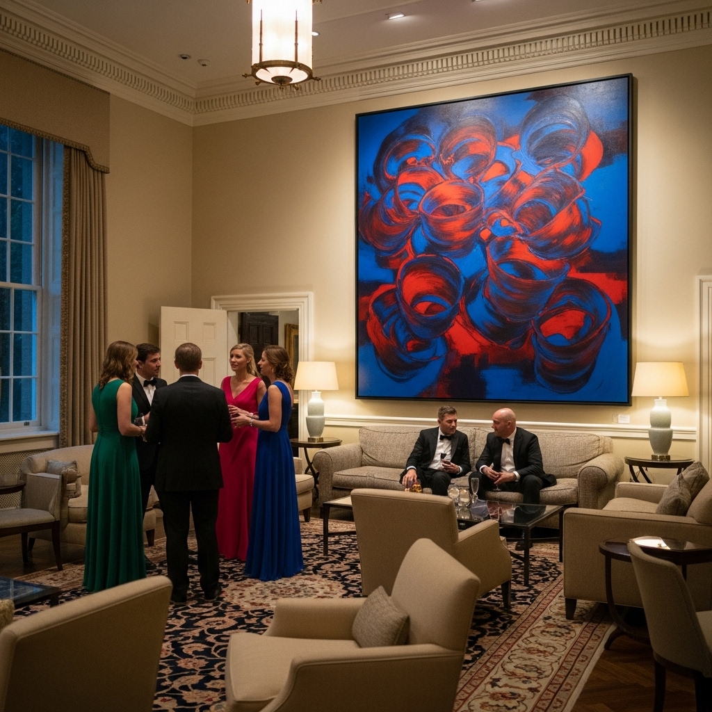
More importantly, it makes art pop and people shine. A vibrant modern painting, a bold sculpture, or even a member in a colorful outfit becomes a focal point against the creamy neutrality. The space itself recedes, becoming a graceful, elegant frame for the dynamic life and conversation happening within it. This flexibility is crucial for clubs that host everything from morning co-working to evening cocktail receptions; the ambiance adapts seamlessly, powered by lighting, while the base palette remains a constant, comforting presence.
More Than a Trend: Signaling a New Era of Quiet Power
The adoption of Chantilly Blonde transcends interior design; it’s a non-verbal communication of values. The era of loud, logo-driven, ostentatious displays of wealth is waning in these circles. The new currency is taste, discretion, and confidence that doesn’t need to shout. A Chantilly Blonde interior whispers. It speaks of a membership that values subtlety, connection, and a refined quality of life over flashy spectacle.
This palette aligns perfectly with the “old money aesthetic” and “stealth wealth” phenomena, translating them into a spatial experience. It suggests heritage, permanence, and a worldliness that is comfortable in its own skin. Choosing this complex, nuanced neutral is a powerful aesthetic stance. It says the club is not chasing fleeting trends but is invested in creating a timeless, enduring haven for its community.
Bringing the Club Home: The Chantilly Blonde Influence
The influence of this members’-club aesthetic is already trickling into residential design, as those who frequent these spaces seek to replicate the feeling at home. The lesson isn’t to copy a color exactly, but to embrace the principles of warmth, texture, and serene neutrality. Homeowners are moving away from cool grays and embracing warmer, cream-based neutrals on walls. They’re investing in textured, natural material palettes—stone, wood, wool, linen—in a cohesive, tonal range.
The goal is to create a personal sanctuary that prioritizes comfort and timelessness over trendiness. It’s about crafting a backdrop for your own life that feels both elevated and effortlessly livable. After all, if this palette can cultivate connection and calm for the world’s most exclusive communities, imagine what it can do for your personal space.
Chantilly Blonde is more than a color of the moment. It is the visual manifestation of a cultural shift towards quiet luxury, mindful living, and spaces that nurture genuine human interaction. In the hushed, creamy corners of the world’s most private clubs, a new standard for sophisticated refuge is being set—one warm, textured, perfectly calibrated shade at a time.



I just couldn’t depart your site before suggesting that I actually enjoyed the standard info a person provide for your visitors? Is gonna be back often in order to check up on new posts